Horizon Finance
A fintech application proof of concept.
Horizon is my fintech proof of concept. I built it to show how I would organise balances, transfer forms, activity and payment confirmations in one application. It is not a bank or a live money-transfer service; the accounts and transactions shown are demonstration data.
Fintech accounts, transfer steps and transaction history
My role: Concept design and fintech application development.
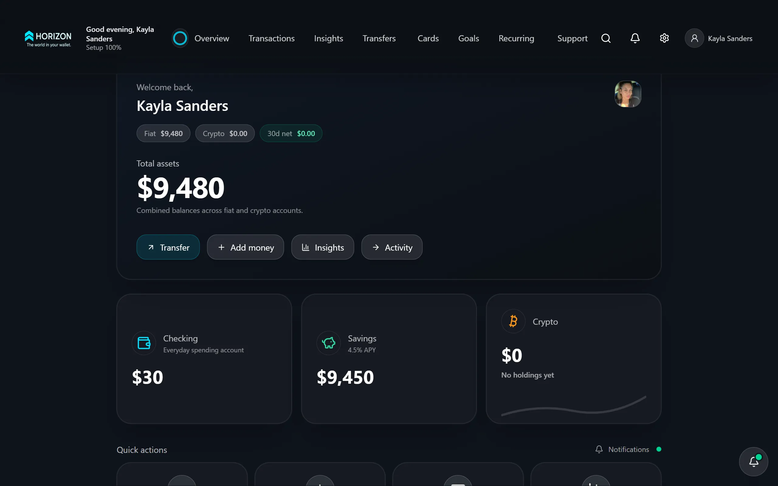
What the site is for.
Horizon is a fintech proof of concept I built to explore the everyday parts of a money app: checking a balance, entering a recipient, reviewing a transfer and finding a receipt afterwards. It demonstrates those screens and workflows without presenting itself as a bank or live payment service.
How it comes together.
Account cards separate the different balances. Transaction history gives the detail, and notifications draw attention to recent activity. Transfer screens take someone through choosing a method and entering the recipient’s information before showing a confirmation. The phone layouts keep those same tasks available without trying to squeeze an entire desktop screen into a small space.
A closer look.
01The overview keeps balances and common actions close together, so checking an account does not require opening several pages.
02Transaction history and notifications serve different purposes: one is a record to look through, the other points out recent changes.
03Transfer forms group the recipient and payment details into a sequence that can be checked before moving on.
04Confirmation screens show the completed action and offer a receipt, giving the user a clear place to finish.
What this demonstrates.
This gives a prospective client a concrete example of the fintech experience I can build. A production version would need an authorised payment provider, server-side payment verification and account reconciliation. The screenshots show demonstration accounts and transactions, not real customer funds.
For a closer technical look +
Frontend
Account cards, recipient forms, transfer methods, notifications and receipts share a consistent layout across desktop, tablet and phone.
Production integration scope
Production integration scope: connect an authorised payment provider, verify callbacks on the server and reconcile the ledger. The concept demonstrates the customer-facing flow rather than production payment settlement.
What you can review
Compare the transfer form with the confirmation screen and mobile views. These show the progression through a payment task without moving real money.
A look through the site.
11 images / Open to enlargeAccount balances and common actions are brought together on the overview.
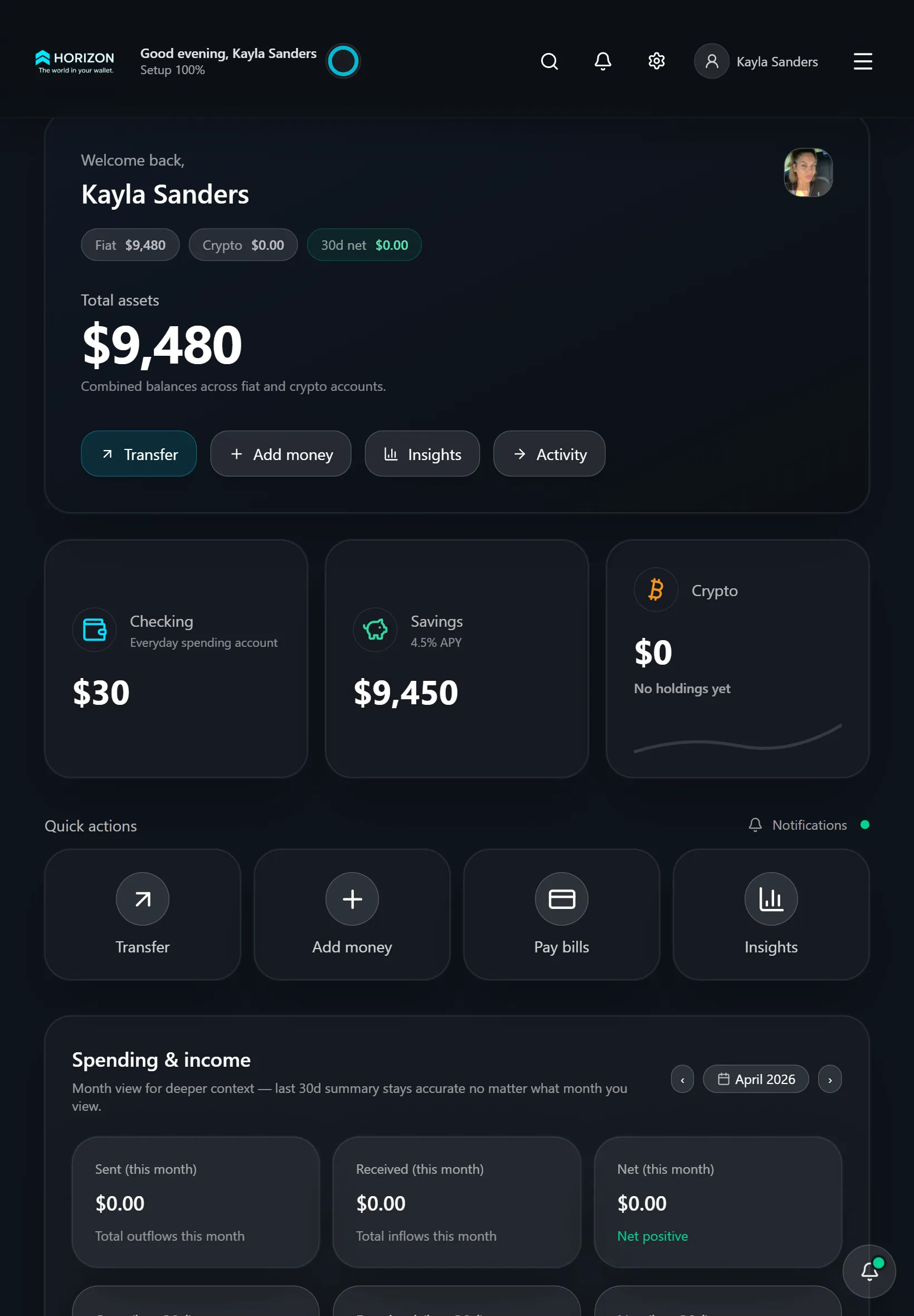
The tablet layout keeps the overview and account actions within reach.
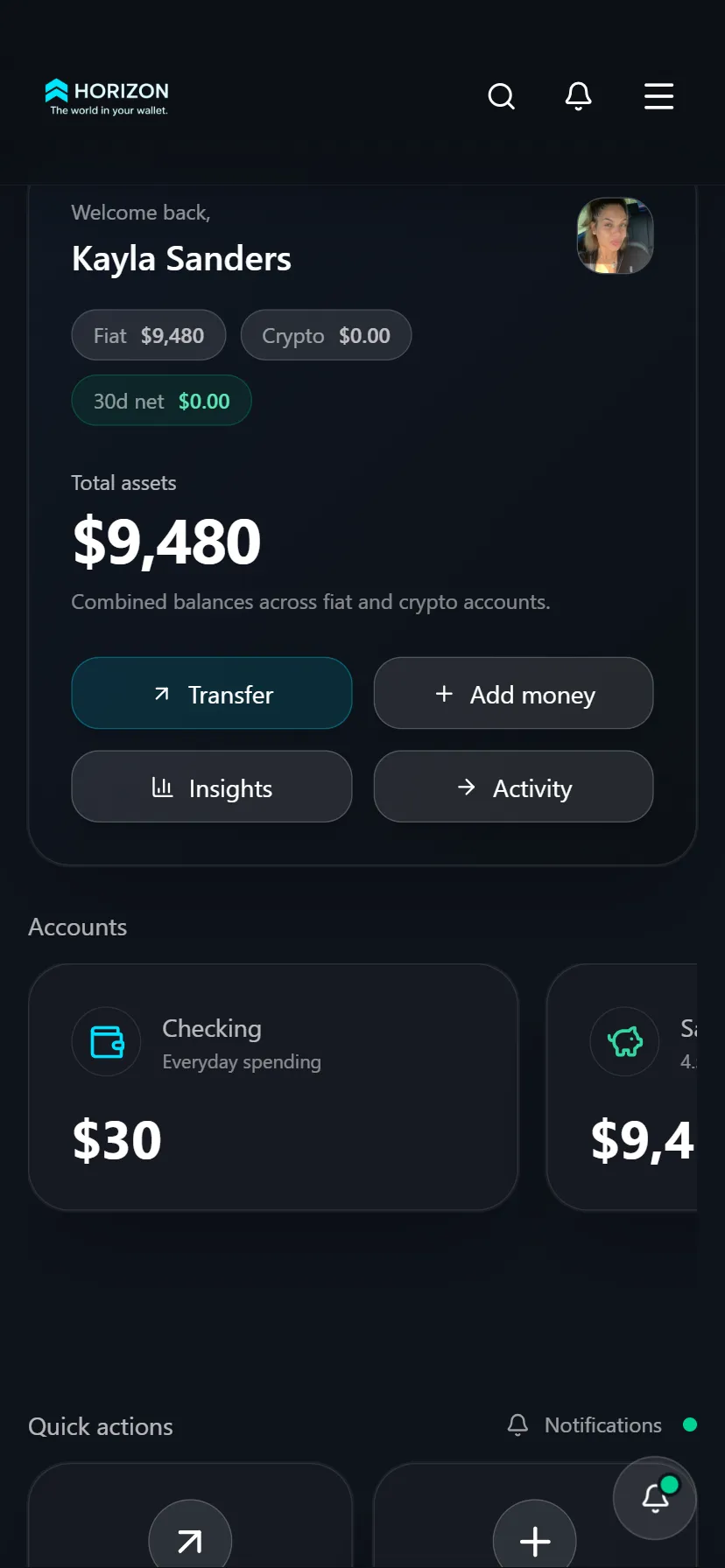
Account cards are arranged for browsing on a smaller screen.
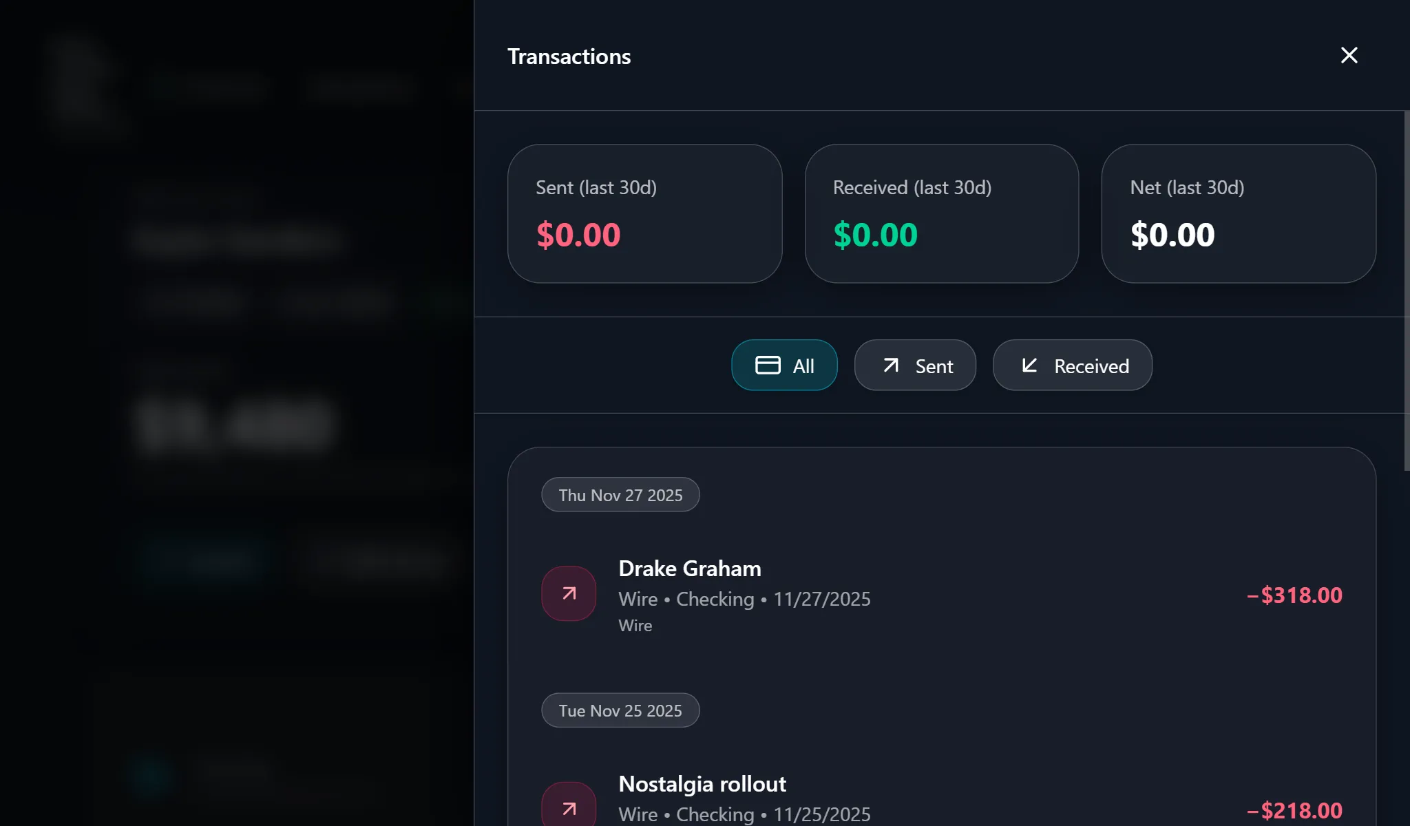
The transaction list gives users a record of account activity.
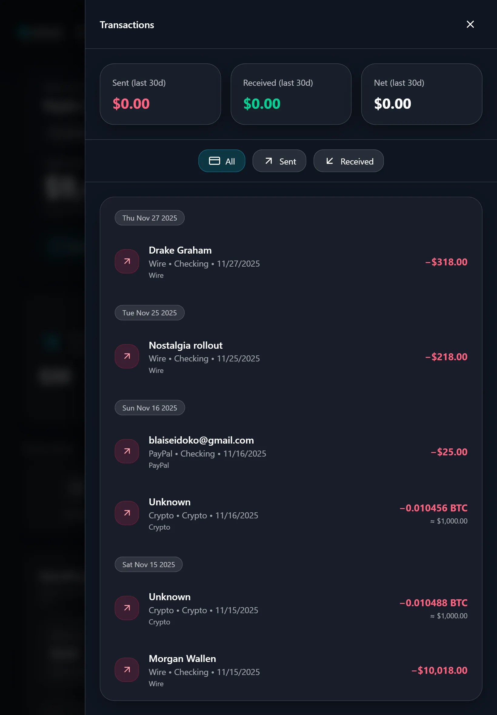
Payment history can also be reviewed in the tablet layout.
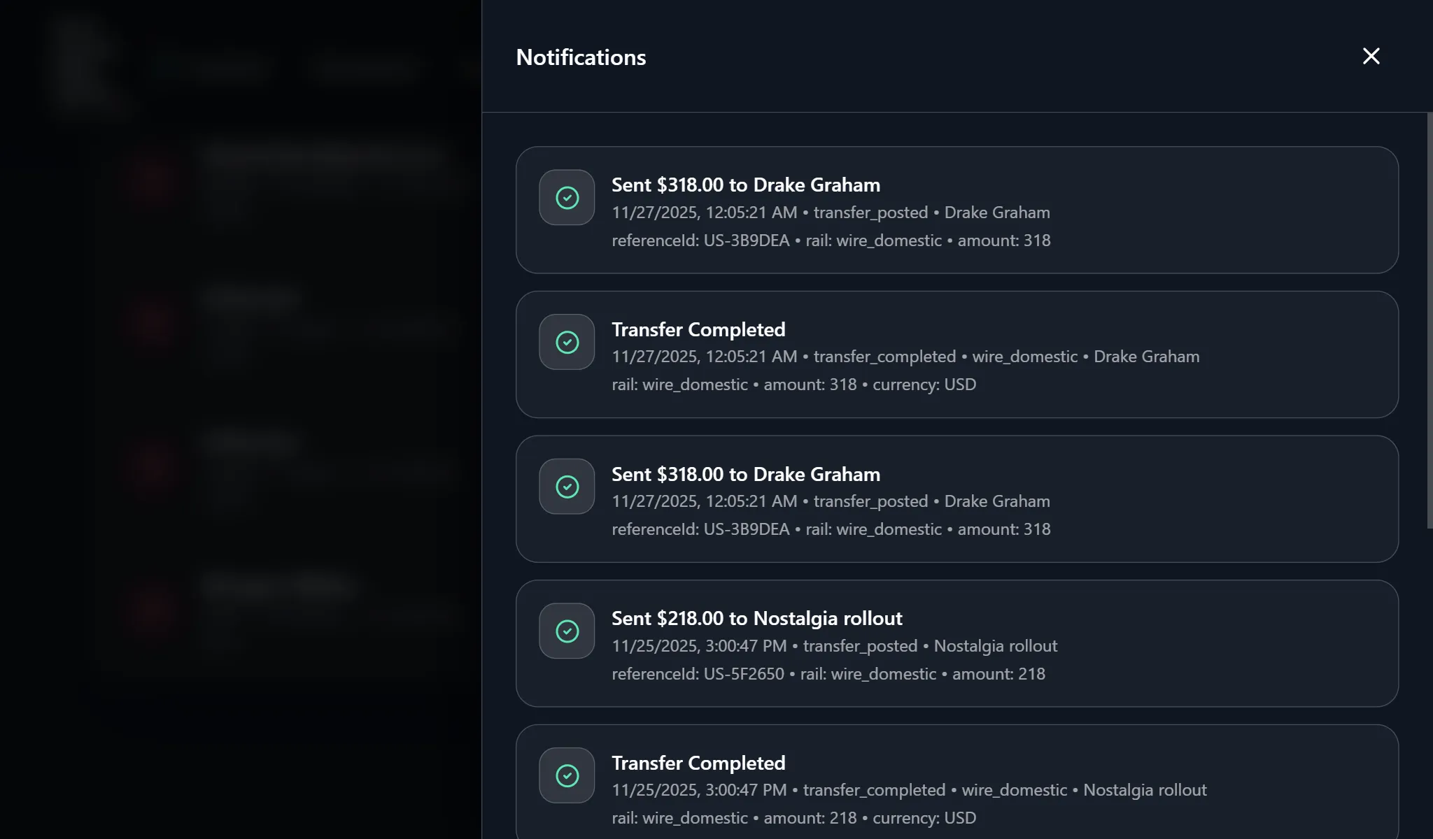
Notifications draw attention to recent activity and payment updates.
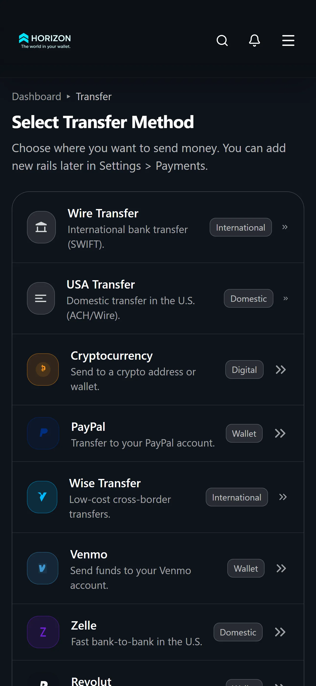
Users choose a transfer method before entering the payment details.
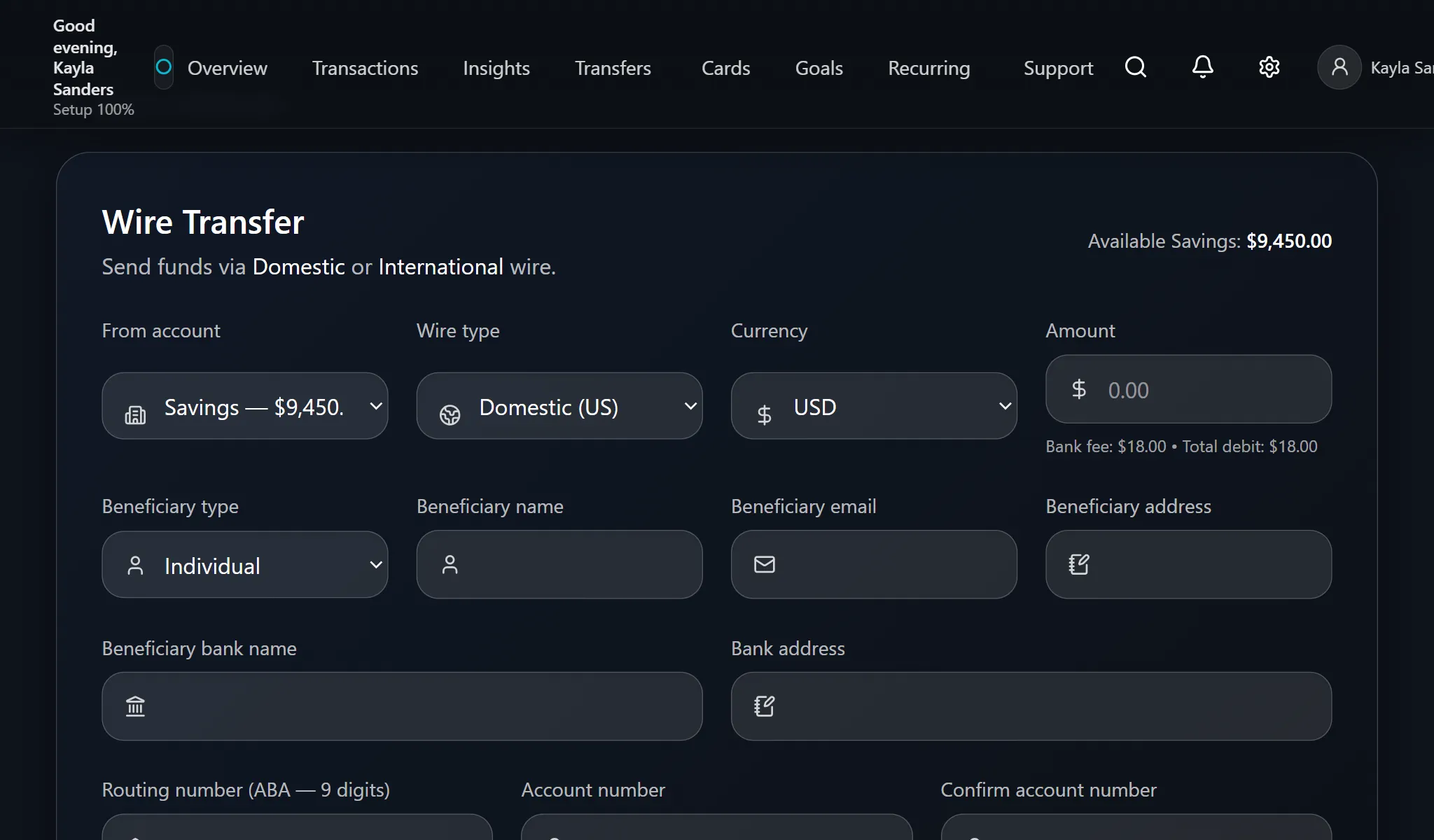
Recipient and bank information are grouped into a transfer form.
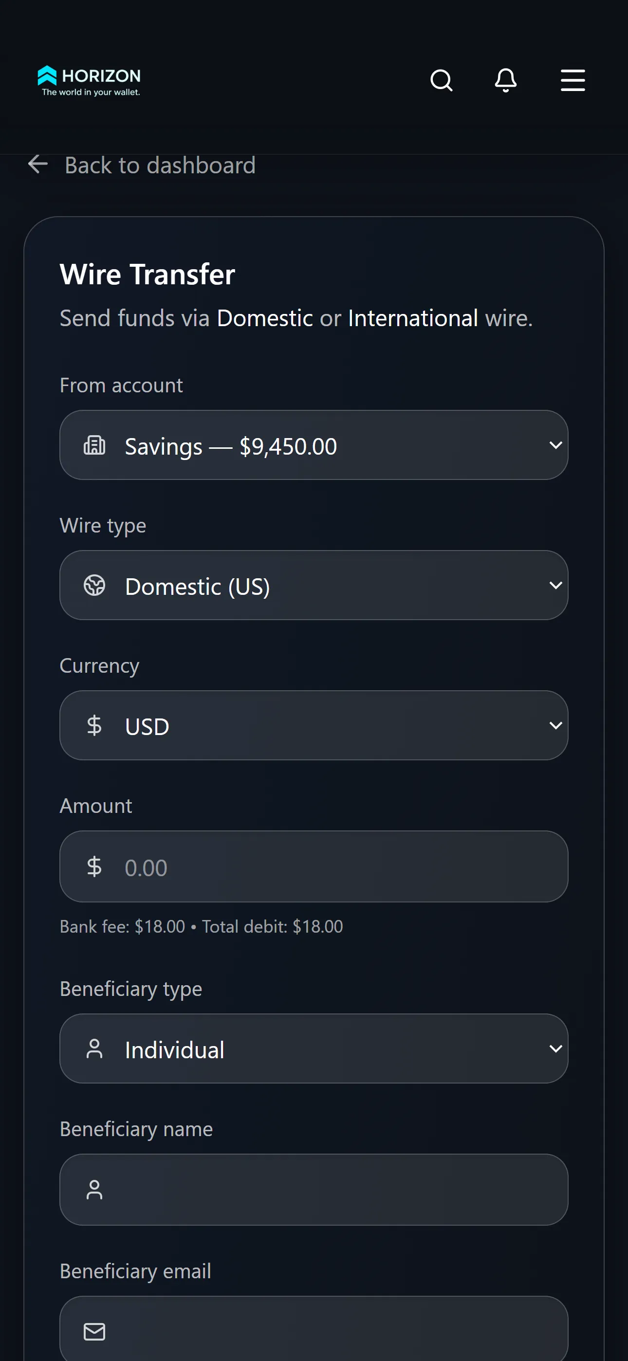
The same transfer information is arranged vertically for phone users.
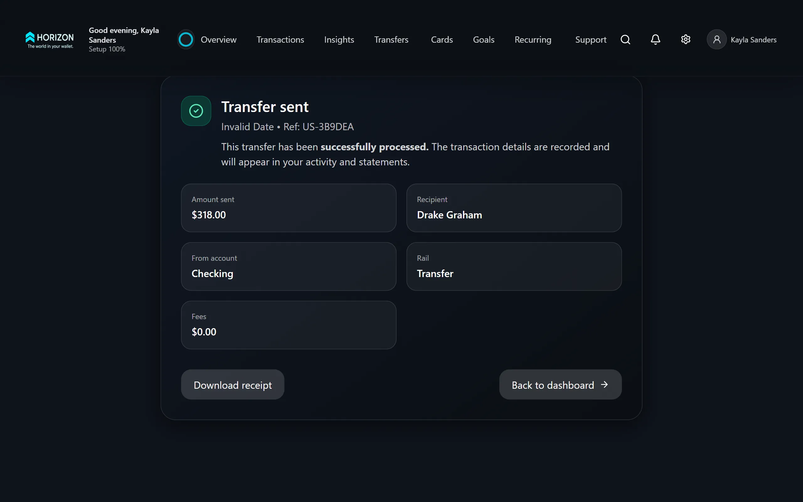
The confirmation screen summarises the transfer and offers a receipt.
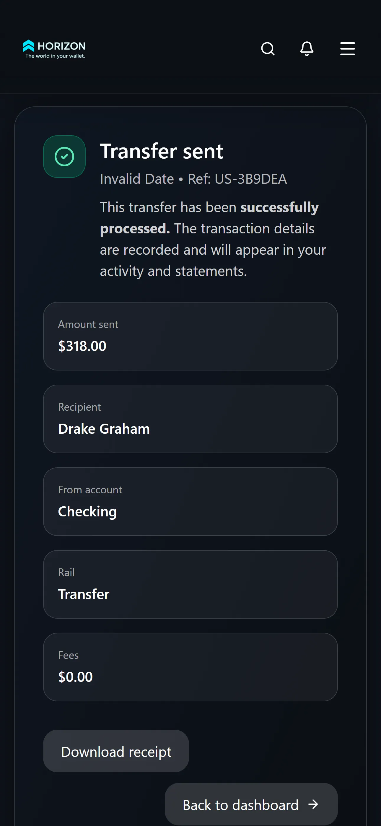
On phones, the confirmation keeps the key details and receipt together.